Redefining the Home Page Experience with User-Centered Design
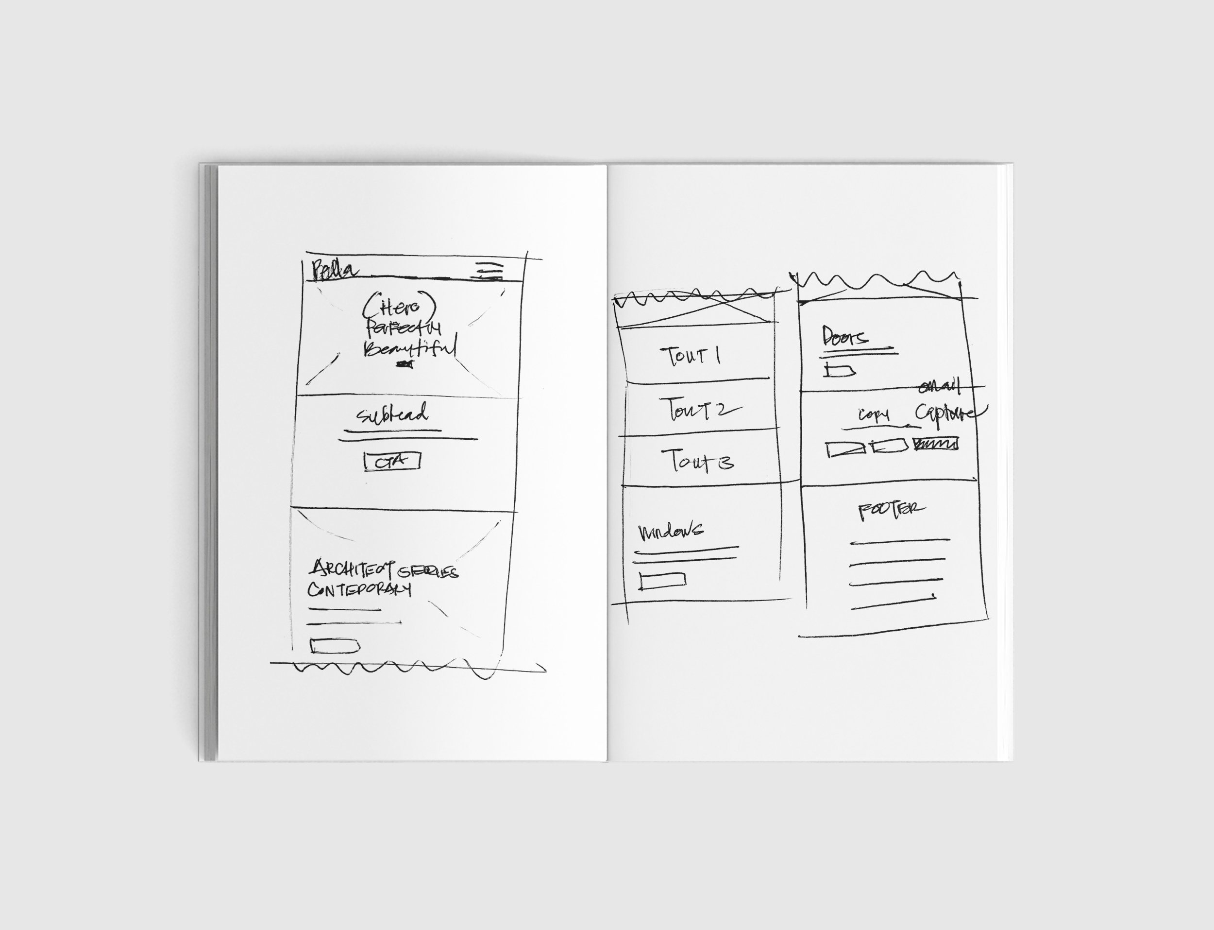
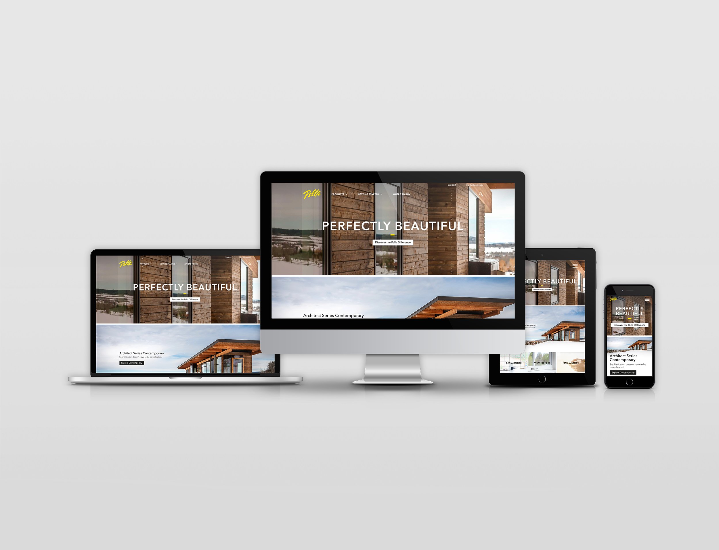
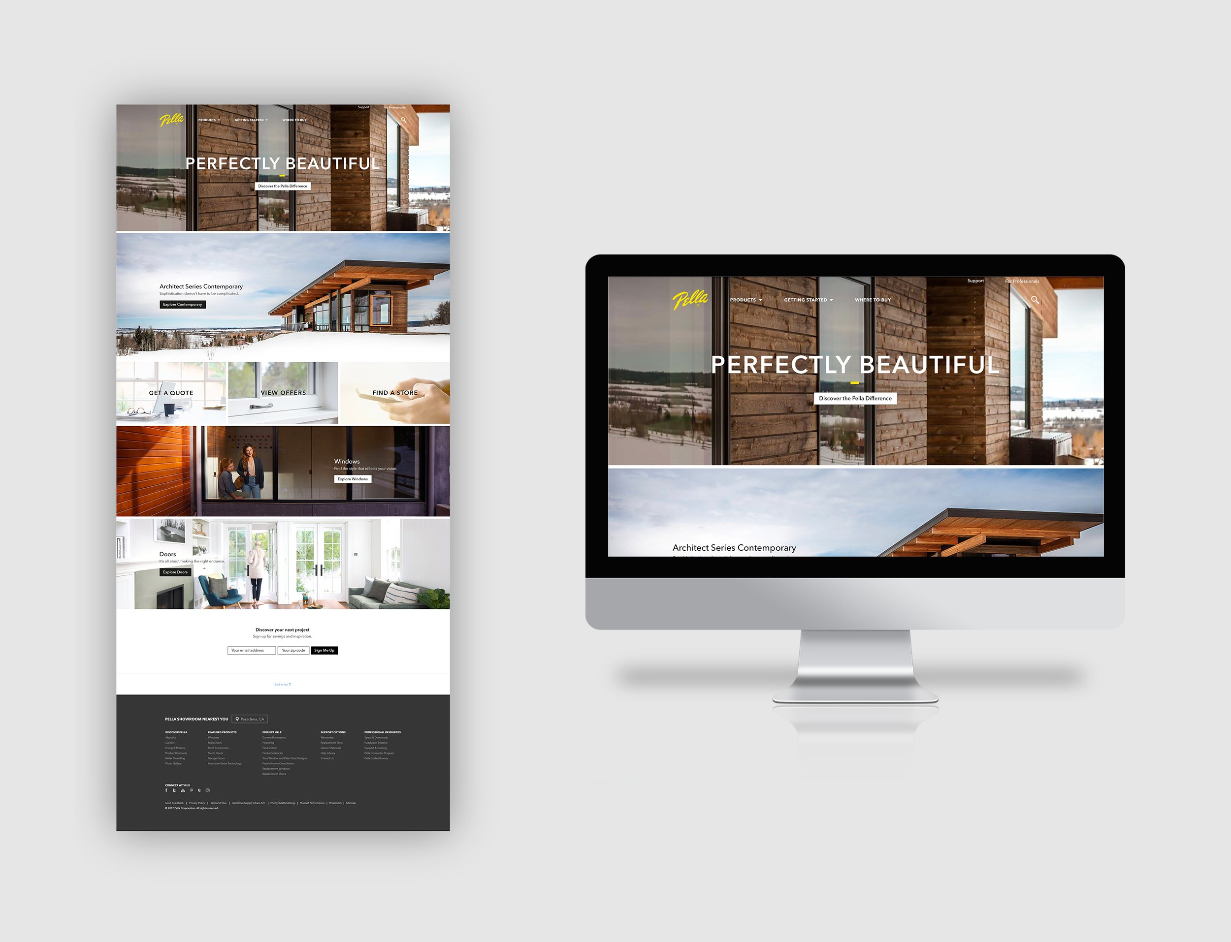
After years of fostering trust and building a strong relationship with Pella, our team encouraged the client to update their brand with fresh photography and a streamlined home page design. By shifting to a mobile-first approach and minimizing content clutter, we let their products speak for themselves. Through three months of A/B testing, the new design outperformed the original, reducing drop-offs and guiding users down the scheduling consultation funnel. This redesign not only refreshed Pella’s brand presence but also significantly improved user engagement and site performance.


Pella’s Initial Home Page Approach
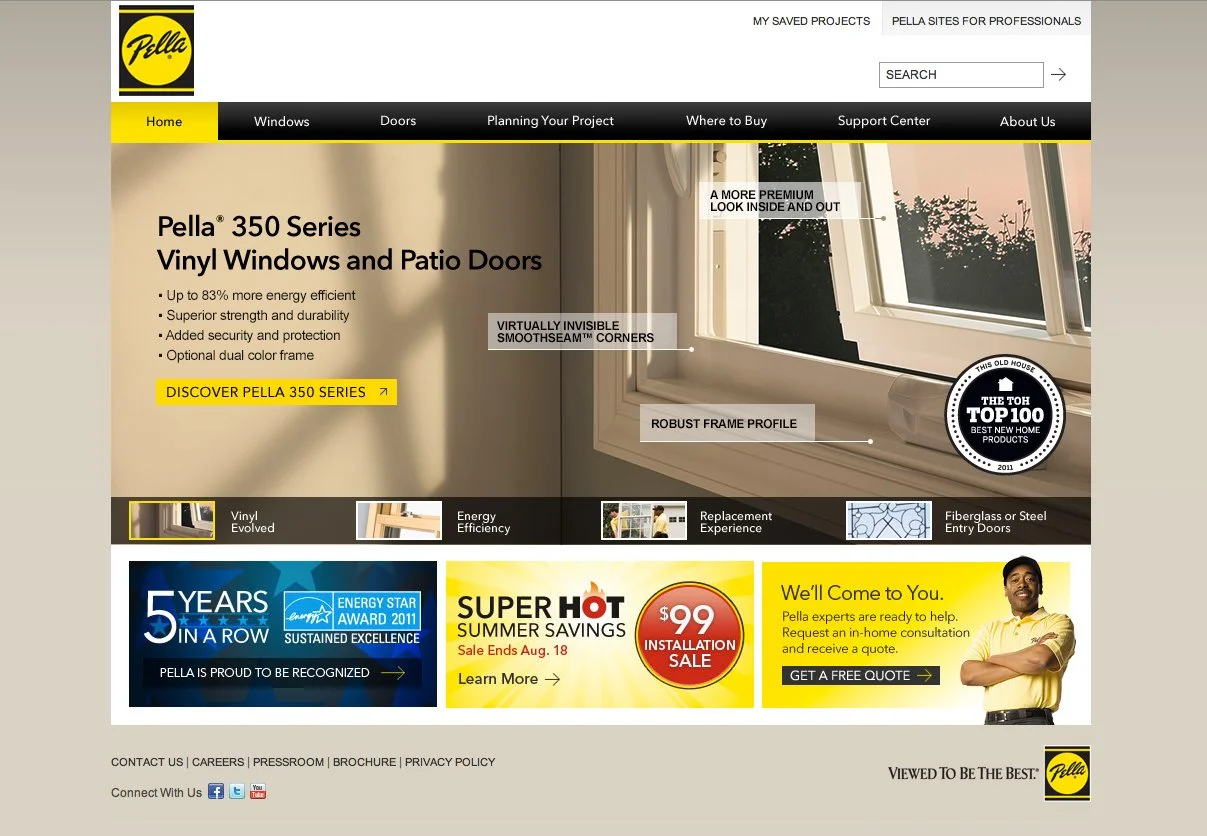
Pella’s original home page design, which our team had been maintaining, was heavily content-driven. The client believed users needed to be highly informed before they began scrolling, resulting in an information-heavy, cluttered layout above the fold. This approach overwhelmed users and contributed to higher drop-off rates, underscoring the need for a more streamlined and user-focused redesign.
